Verifying identities with confidence
Customer 360
Fraud investigators judged every identity verification in isolation, so repeat fraudsters could slip through one transaction at a time. Together with the data science and graph teams, we connected disparate pieces of personal data into a 360° view of a customer.
- Company
- Jumio
- Year
- 2024
- Role
- Product Designer
- Focus
- AI-Centered Identity VerificationFraud Detection
Context
Jumio verifies the identities of people signing up for banks, marketplaces, and other regulated businesses. When an automated check can't clear someone, the case lands with a fraud investigator who must decide, often within minutes, whether the person is who they claim to be.
Definitions
- Transaction
- A single identity verification event: the ID document, selfie, and biometric checks an end-user submits when signing up with one of our customers.
- Case
- A transaction escalated for manual review, worked by a fraud investigator in the Jumio portal.
- PII
- Personally identifiable information such as name, date of birth, address, and document numbers.
Problem
We only verified information based directly on the end-user's provided ID documents, selfie, and other biometric data. These data points were siloed within a single identity verification transaction, so an investigator reviewing a case had no way of knowing that the same face, device, or document details had already appeared in earlier verifications under a different name.
That blind spot is exactly where serial fraud lives. Working with the fraud analytics team, we estimated that roughly a third of confirmed fraud cases involved data points already seen in prior transactions, and investigators were spending 15 to 20 minutes per case manually hunting for those connections across separate tools.
Leadership had also made AI/ML investment a company priority. Customer 360 became the vehicle for both: surface the connections investigators couldn't see, and package the data science team's risk models into something an investigator could act on.
Goals
High-level goals
- 01
Faster, more confident decisions
Put risk insights from the AI/ML team directly in the transaction and case pages, so investigators start from a conclusion to verify instead of a pile of raw evidence.
- 02
Make hidden connections visible
Connect PII, devices, and documents across transactions, potentially including data shared by other customers, into one view of the person.
- 03
Legible at a glance
Present those relationships in an interface an investigator can parse in seconds, not a data science tool.
With Product we agreed on how we would judge success once the feature was live:
- Investigation time per case
- Median time from opening a case to reaching a decision, measured against the 15 to 20 minute baseline.
- Insight engagement
- How often investigators expand, cite, or act on an insight, telling us whether the AI output is trusted or ignored.
Framing
Designing for the investigator, not the model
The earliest debates weren't about screens; they were about what the centerpiece should be. The data science team was excited about the relationship graph. I kept pulling the conversation back to the investigator's actual question: can I trust this person enough to approve them right now?
That framing drove the hierarchy. Risk insights went above the fold because they answer that question fastest. The PII comparison became the default view because cross-checking provided data against document credentials was already how investigators worked, just spread across tabs. The graph, powerful but unproven, became a deep-dive view rather than the landing experience.
We also weighed a simple table of linked records against a nodal graph. The graph won because the engine the graph team was evaluating rendered nodal views natively, and because connection patterns, like one device fanning out to many identities, read instantly in a graph and poorly in a table. I documented the tradeoff so we could revisit it if the engine choice changed.
First Iteration
Rough mockups to start the conversation
With a general idea of where the insights and graph should live, we started with rough Figma mockups to kick off discussions with Product and Engineering.
Insights from the data science team's work were placed within the transaction and case details pages, important enough to sit above the fold, using existing design system components to reduce engineering effort.
Scope later expanded to displaying the user's PII as the default view. Its value lay in comparing the information provided by the customer against the credentials in their documents.
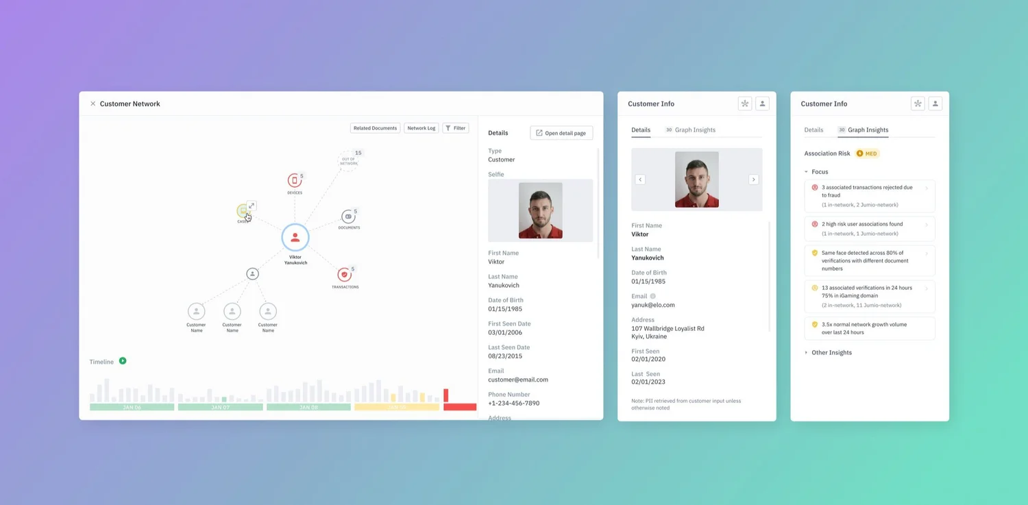
The headline feature was a graphical view of all data centered around the end-user: a quick, digestible way to understand a user's network and its changes. The graph engine was still being assessed, so we assumed a nodal view and moved forward.
Research
User research insights & iterations
We ran 8 moderated sessions with internal fraud SMEs and solution engineers, walking each through a scripted case in a Figma prototype. Internal participants were a limitation we accepted for speed, with customer-facing validation planned to follow the demo. The insights and PII panel tested strongly; the graph's value remained unclear due to too many uncertain variables.
“I don't need every signal you have. Tell me the two things that would make me reject this person, and let me check them myself.”
Unclear source for PII data
The source of the personal information wasn't evident, so we added an explicit note about where the data came from, and expanded the panel with past cases, first seen, last seen, and number of verifications.
Insight cognitive overload
Showing every available insight overwhelmed investigators. We did away with categories and broke insights down into high-risk versus other, with "other" collapsed by default, so investigators see what's actually relevant.
Final Designs
The latest iteration
After many discussions with my design partner and Product, we landed on this iteration before handing over to development, with the intention of having a demo ready for the Money 20/20 conference.
The demo deadline forced real scope calls. We cut graph filtering and history scrubbing, kept the high-risk insight set deliberately narrow, and polished the PII comparison, since that's where testing showed conviction. Deciding what not to build was as much a design deliverable as the mockups.
Outcome
Takeaways
Customer 360 shipped as a working demo at Money 20/20, where it anchored the sales team's prospect conversations and became the reference point for the company's AI/ML story that year. Shifting priorities and changing roadmaps delayed a full launch, but the insights work was folded into the risk-scoring roadmap, and the project carried lessons I still use.
Adapt to changing requirements
New timelines, resourcing issues, and re-prioritization meant scope was constantly changing. I had to adapt and still deliver the best design within tight deadlines.
Disagree with evidence, then commit
I pushed back on the graph's unproven value, with research to back it, and we still shipped it for the demo. Making the case with evidence, then committing fully, kept trust with data science intact and left a documented reason to revisit the decision.
Choosing what we won't do
With a working demo due for Money 20/20, it was important to decide with Product what served the demo best, rather than building a feature-rich product.